Optimize Your Flag Design with a Color Contrast Analyzer
Designing a flag that captures attention requires more than just creativity—it’s about visibility. Whether you’re crafting a flag for a community event, a sports team, or a personal project, ensuring the colors stand out in different environments is crucial. That’s where a tool to check color visibility comes in handy, helping you test and refine your palette for maximum impact.
Why Visibility Matters in Flag Design
Flags are often viewed from a distance or under varying conditions—think windy hilltops in glaring sun or shadowy indoor venues. If the shades you pick don’t have enough distinction, your design can lose its punch. A quick analysis of color pairings can reveal whether they’ll pop or fade into the background, saving you time and frustration. Plus, it’s not just about aesthetics; clear visibility ensures your flag communicates its message effectively to everyone who sees it.
Simple Steps to Better Designs
Start by experimenting with different hues and testing them against common backgrounds. Tools like these make it easy to spot issues and offer practical fixes, so your flag shines in any setting. Take a moment to evaluate your choices, and you’ll create something truly memorable.
FAQs
Why does color contrast matter for flag design?
Great question! Color contrast is key because it determines how well your flag can be seen from a distance or in tricky lighting. If the colors blend together, your design loses impact—whether it’s flying at a stadium or hanging in a classroom. Our tool checks the contrast between your chosen colors and rates them, so you know if they’ll stand out or need a tweak. It’s all about making sure your flag grabs attention for the right reasons.
What do the contrast scores mean?
The scores are a quick way to gauge visibility. A 'pass' means your color combo is clear and easy to distinguish, even from far away. 'Borderline' suggests it’s okay but could be better, especially in harsh conditions like bright sunlight. A 'fail' indicates the colors are too similar and might blur together. Don’t worry, though—we’ll suggest tweaks like darkening one shade to help you nail a winning look!
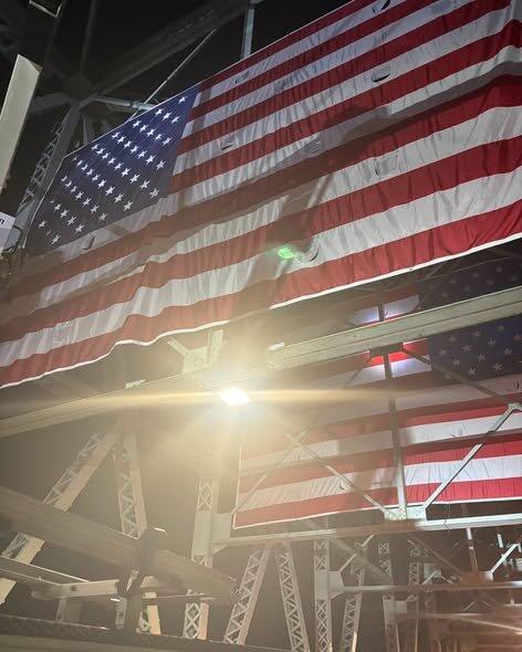
Can I test my flag colors for nighttime visibility?
Absolutely, we’ve got you covered! Just select 'nighttime' as your viewing condition when using the tool. This setting mimics low-light scenarios where contrast becomes even trickier. You’ll get a tailored score and feedback on how your colors hold up after dark. It’s super handy for flags that’ll be displayed at evening events or in dimly lit spaces.