Trade show graphics are your booth's first impression, grabbing attention in just 3–5 seconds. They play a crucial role in attracting visitors, building trust, and converting leads - especially when over 80% of attendees have purchasing authority. Here's what you need to know:
- Key Design Principles: Use large logos and bold colors for long-range visibility (50–100 feet), clear headlines for mid-range engagement (10–50 feet), and detailed information for close-up interactions (1–10 feet). Stick to high-contrast colors, sans-serif fonts, and simple layouts with 40% white space.
- Material Choices: Options like vinyl, fabric, and rigid substrates each serve different purposes. Vinyl is durable for outdoor use, fabric is lightweight and portable, while rigid materials like PVC offer a polished look for permanent displays.
- Print Quality: Ensure high clarity with vector files, CMYK color mode, and proper resolution (100–150 DPI for large graphics). Add bleeds and safe zones to avoid cropping issues.
- Tailored Messaging: Align graphics with your audience and event. B2B shows benefit from technical details, while B2C events thrive on emotional, lifestyle-driven visuals. Modular designs and digital displays allow flexibility across multiple events.
Trade shows deliver a 4:1 ROI on average, making professional visuals a smart investment. This guide covers everything from design tips to material selection and print specs to ensure your booth stands out and drives results.
Design Principles for Trade Show Graphics
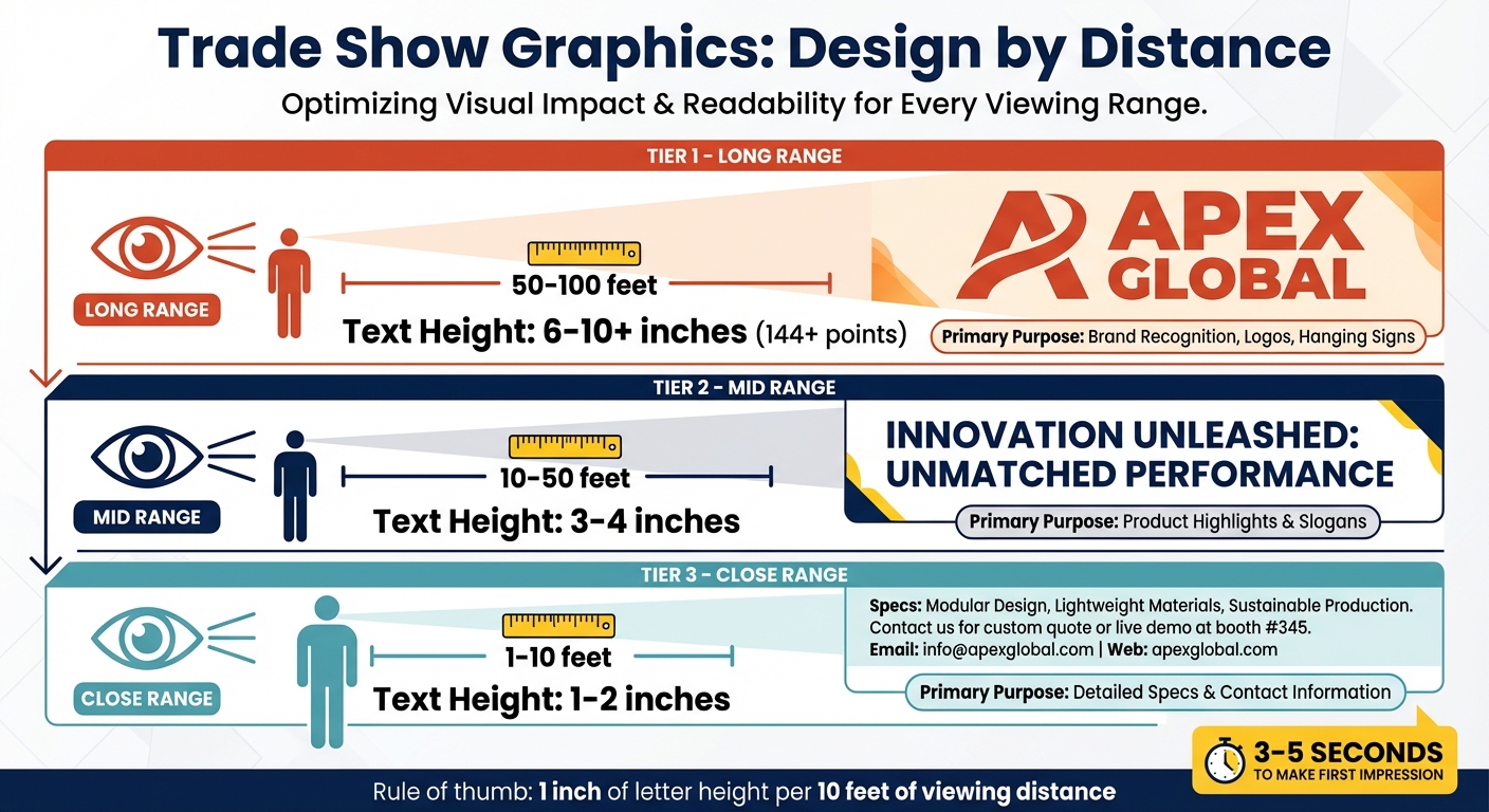
Trade Show Graphics Viewing Distance Guide: Text Size and Purpose by Distance
Color, Font, and Layout Basics
When designing trade show graphics, think about how they’ll be viewed at different distances. From over 50 feet, your graphics should focus on brand recognition. Between 10 and 50 feet, headlines take center stage. And for those standing 1 to 10 feet away, include detailed information.
To make your visuals pop, use high-contrast colors. Pairings like dark navy on white or black on yellow stand out better than subtle ones. Warm colors, such as red and orange, grab attention, while cooler tones like blue and green create a calm, professional feel. Stick to three main colors - this keeps your design clean and avoids overwhelming the viewer.
For text, sans-serif fonts are easier to read from a distance. A good rule of thumb: use 1 inch of letter height for every 10 feet of viewing distance. For example, headlines meant to be seen from 10–15 feet should use letters 3–4 inches tall. Keep taglines short - seven words or less - so they’re easy to read in passing.
When it comes to finishes, matte or satin options are best. Glossy surfaces can create glare under the bright lighting typically found at trade shows, making your message harder to read.
These basics set you up for a design that’s visually clear and easy to navigate.
Creating Visual Hierarchy
Your booth’s graphics should guide the viewer’s eye naturally. Start by layering your design into three sections:
-
Top layer (above 7–8 feet): This is where your logo and tagline go. Position them high enough to stay visible, even in a crowded space. As Mark Krenn, Founder & President of Coastal Signs Plus, says:
"You never get a second chance at a first impression."
- Middle layer (5–8 feet, eye level): Use this space for your value proposition and product highlights. Text here should be slightly smaller (around 3–4 inches tall) but still easy to read.
- Bottom layer (5–6 feet): Reserve this area for detailed specs, success stories, or contact details. This information is for people who are already engaged with your booth.
Arrange all elements to follow a natural top-to-bottom, left-to-right flow, and include a clear call to action to keep visitors focused.
Using White Space and Simple Text
Once your layout is structured, white space and simplicity can make your design even more effective. Aim to leave 40% of your graphic’s surface empty, as Bruce White from GES explains:
"The overall rule of thumb for booth graphics is that they should contain 40 percent empty space."
This breathing room helps your design feel uncluttered, making colors and key points stand out.
Keep your text short and impactful - limit each display to two or three main points. Use one large, high-quality image instead of multiple smaller ones, and avoid placing critical details like your website or contact info at the very bottom, where they might be missed. Nar Galvez from Design One Printing offers this advice:
"Treat signage as a visibility system first, a brand canvas second."
By combining these strategies - white space, simple text, and a clear layout - you’ll create a booth design that’s easy to read, visually appealing, and engaging for attendees.
| Viewing Distance | Recommended Text Height | Primary Purpose |
|---|---|---|
| 1–10 feet | 1–2 inches | Detailed specs and contact information |
| 10–50 feet | 3–4 inches | Product highlights and slogans |
| 50–100 feet | 6–10+ inches | Brand recognition, logos, and hanging signs |
sbb-itb-4fbc981
Materials and Printing Options
When creating trade show graphics, your choice of materials plays a huge role in durability, ease of transport, and how your display ultimately looks.
Comparing Materials: Vinyl, Fabric, and Rigid Substrates
The material you pick directly impacts how your graphics perform. Here’s a breakdown of the most common options:
- Vinyl: This PVC-based material is waterproof and weather-resistant, making it ideal for outdoor banners, floor graphics, and window clings. It’s flexible and can be rolled for transport, but folding it can cause creases that are hard to remove.
- Fabric Graphics: Typically made from polyester, fabric is lightweight, wrinkle-resistant, and has a non-reflective finish. It’s printed using dye-sublimation, where the ink is embedded into the fibers. EJ Yates, Graphic Production Manager at STAR, says:
"Because the ink is embedded, it won't crack or peel, even after repeated use."
Fabric graphics are also very portable - a 10-foot fabric wall with hardware weighs less than 40 pounds, making it a breeze to ship.
- Rigid Substrates: Materials like foam core, PVC (Sintra), and Aluminum Composite Material (ACM) offer a polished, sturdy look. Foam core is lightweight but prone to dents, so it’s better for short-term use. Gator board is more durable for transport. Meanwhile, PVC and ACM are heavier but long-lasting, making them great for permanent displays.
| Material Type | Durability | Portability | Best Use Case |
|---|---|---|---|
| Vinyl | High (Weatherproof) | Moderate (Rollable) | Outdoor banners, floor decals, window clings |
| Fabric | Moderate (Wrinkle-resistant) | High (Foldable/Light) | Modular booths, backdrops, backlit displays |
| Foam Core | Low (Fragile) | Moderate (Must ship flat) | Temporary indoor signs, easel presentations |
| PVC (Sintra) | High (Rigid) | Low (Heavy/Flat) | Long-term directional signage |
| ACM (Dibond) | Very High (Permanent) | Very Low (Heavy) | Premium permanent displays, exterior building signs |
Once you’ve chosen the right material, the next step is ensuring your print quality matches your vision.
Print Quality Requirements
Large-format printing operates differently than desktop printing. For trade show displays viewed from 10–20 feet away, 100–150 DPI at full size is the sweet spot. While some printers can hit resolutions up to 1,200 DPI, it’s unnecessary for graphics meant to be seen from afar. In fact, for massive murals, even 60 DPI may suffice since the human eye blends details at a distance.
Here’s what to keep in mind for print quality:
- File Types: Use vector formats like .AI, .EPS, or .SVG for logos and text - they scale without losing clarity. Raster formats (.TIFF, .JPG) work for photos but require high resolution to avoid pixelation.
- Color Mode: Always design in CMYK, not RGB, for accurate color reproduction. Use profiles like Coated GRACoL 2006 for better results.
- Proofing: Don’t rely on your screen - request a physical proof to confirm colors and sharpness on your chosen material.
- Additional Tips: Convert fonts to outlines to prevent errors, include a 0.25-inch bleed on all edges, and keep critical elements at least 2 inches from the edges to avoid interference with hardware like grommets or pole pockets.
With your print quality locked in, you can focus on making your graphics adaptable across multiple events.
Designing for Multiple Events
If your trade show schedule includes several events, your graphics need to be versatile. Here’s how to make them work across different booth setups:
- Fabric Graphics for Flexibility: Fabric is washable, foldable, and less prone to damage during transport. Systems like Silicone Edge Graphics (SEG) and tension fabric frames stretch the material to remove wrinkles, and they pack into compact cases. A quick steam after setup can handle any travel creases.
- Lamination for Rigid Graphics: Protect rigid displays with lamination - 10-mil on the front and 5-mil on the back adds scratch and fade resistance.
- Modular Designs: Create modular elements that can be rearranged or swapped out to fit different booth sizes. Use vector artwork so you can resize logos and text without losing clarity.
- Storage Tips: Roll vinyl graphics on a core to avoid permanent creases. Also, ensure your graphics meet NFPA 701 flame-retardant standards, as many venues require this certification.
Matching Graphics to Your Audience and Event
Design principles are universal, but the real magic happens when you tailor them to your audience and the event you're attending. A design that works perfectly for a tech conference might completely miss the mark at a lifestyle expo.
Understanding Your Audience
Start by asking yourself some key questions: Is your brand fun and playful, or is it more serious? Does it lean toward a masculine or feminine vibe? Are your customers more traditional, or are they trendsetters? The answers to these questions will guide your design decisions, from the colors you use to the type of fonts you choose.
B2B audiences tend to gravitate toward graphics that highlight expertise, technical details, and measurable results. They’re looking for proof that you can solve their problems. On the other hand, B2C audiences are drawn to visuals that spark emotional connections and showcase lifestyle benefits. If you're at a consumer event, think about creating eye-catching, shareable visuals that attendees will want to post on social media.
The most effective graphics deliver benefit-driven messaging. For example, instead of a generic phrase like "Financial Services", go for something like "Secure Your Loan Without Collateral". And remember, trade show attendees form their first impression of your booth in just 3 to 5 seconds. Your main message needs to grab attention instantly.
A smart approach is to use a three-tier graphic strategy that speaks to your audience at different distances.
- Long-range graphics (100+ feet): Use bold branding to draw people in.
- Mid-range graphics (10–50 feet): Highlight your company name and key offerings to attract foot traffic.
- Short-range graphics (1–10 feet): Provide detailed text or infographics for those who stop to engage.
This layered strategy ensures your booth communicates effectively, whether someone is walking by or standing right in front of it.
Adjusting for Booth Size and Configuration
Your booth's layout and size also play a big role in how your graphics should be distributed. For smaller booths (10x10 feet), focus 60% on mid-range graphics and 40% on short-range details. Medium-sized booths work best with a balance of 40% long-range, 40% mid-range, and 20% short-range graphics. Large booths benefit from an even split: 30% long-range, 40% mid-range, and 30% short-range.
The booth's location matters too. Corner booths, visible from multiple aisles, can take advantage of hanging signs or tall structures to maximize exposure. Meanwhile, center aisle booths should focus on impactful mid-range graphics around the entire perimeter to catch attention from all directions.
Font size is critical for visibility. For someone standing 6 feet away, your text should be at least 2 inches tall. For long-range visibility (50+ feet), use fonts that are 144 points or larger - roughly 2 inches in height. Place your logo and main value proposition in the top third of your display to ensure they remain visible, even in a crowded booth. Keep your core message to 10 words or fewer for maximum clarity.
Customizing Messaging for Each Event
If you're exhibiting at multiple trade shows, flexibility is key. Modular graphic systems allow you to swap panels to highlight different products or services depending on the event. Two-sided panels with different messages on each side can be rotated or reconfigured to suit the theme of the show.
Digital displays, like LED screens, make it easy to update your messaging on the fly. This is especially helpful when you're targeting different buyer personas at the same event or need to adapt between sessions.
Your messaging should align with the event's focus. At technical B2B shows, highlight specifications and ROI in your mid-range graphics. At consumer-focused events, lead with visuals that evoke emotion and showcase lifestyle benefits. Whatever the event, stick to your brand’s color palette and typography for consistency.
Doug from APG Exhibits sums it up well:
"Your display must communicate your primary value proposition instantly and compellingly. Messaging must be clear, concise, and relevant."
Keep taglines short - seven words or fewer - so they’re easy to read for attendees passing by. And remember, over 80% of trade show attendees have purchasing authority. Your graphics need to speak directly to these decision-makers. By focusing on these audience-specific strategies, you'll be well-prepared for the final steps to ensure a flawless presentation.
Final Steps and Execution Tips
You've crafted your graphics with care and tailored them for your audience. Now, it’s time to ensure they transition seamlessly from your screen to the printed material. A few last-minute checks can prevent costly errors and set your booth up for success.
Pre-Print Quality Checklist
Before sending your files to the printer, run through these essential steps. Start with color mode - convert your files from RGB to CMYK. RGB colors often print dull and inaccurate, which can undermine your design's impact. For crucial brand elements like logos, use Pantone spot colors to maintain consistency across materials.
When it comes to resolution, the requirements depend on the size of your graphic. Smaller items like brochures demand 300 dpi at 100% size, while larger banners can work with 100–150 dpi. For massive wall murals viewed from a distance, 60–72 dpi will suffice without compromising sharpness. The general rule? The farther the viewing distance, the lower the resolution you can use.
Don’t overlook bleeds and safe zones. For small-format prints, include a 0.125-inch bleed, while larger graphics may need 0.25 to 1 inch, depending on finishing details like hems or grommets. Keep important elements like text and logos well within the safe zone - 0.25 to 2 inches from the trim edge - to avoid accidental cropping or interference from hardware. Convert all fonts to outlines and embed images to eliminate printing errors.
For black ink, use "Rich Black" (C60 M40 Y40 K100) for large solid areas to create depth, but stick to 100% K for small text to ensure crispness. Submit your files as high-resolution PDFs (PDF/X-1a or PDF/X-4), and always use vector formats for logos and text to prevent pixelation.
| Graphic Type | Recommended Resolution (at full size) | Bleed | Safe Zone |
|---|---|---|---|
| Business Cards/Flyers | 300 DPI | 0.125" | 0.125" - 0.25" |
| Posters (24x36) | 150 - 300 DPI | 0.125" - 0.25" | 0.25" - 0.5" |
| Retractable Banners | 100 - 150 DPI | 0.5" | 1" (Top) / 3" (Bottom) |
| Vinyl Banners | 100 DPI | 1.0" | 1.5" - 2.0" |
| Large Wall Murals | 60 - 100 DPI | 1.0"+ | 2.0"+ |
Nar Galvez from Design One Printing sums it up perfectly:
"Print-ready means your final PDF is sized to the exact finished dimensions, built in CMYK, includes proper bleed and safe margins, and has all fonts outlined and images embedded."
Once you’ve ensured print quality, it’s time to focus on working effectively with your vendors.
Working with Designers and Print Vendors
Collaborating well with your designers and print vendors is key to a polished result. Start the conversation early. Ask your printer for specific file requirements to avoid conversion issues. Many vendors offer layered templates - often Adobe Illustrator PDFs - with clear guidelines for bleeds, fold lines, and live areas. If your graphic is scaled (e.g., 1/4 size for a large display), communicate this clearly so the vendor can resize it correctly.
Provide logos as vector files (AI or EPS) to ensure they scale without quality loss. For projects where color accuracy is critical, request electronic proofs for layout and spelling checks, but also invest in physical "hard proofs" for color and resolution verification. While these can cost around $95 per file and take 3–5 extra days, they’re invaluable for ensuring your final product is flawless.
For a professional finish, choose matte or satin finishes over high-gloss to reduce glare under harsh trade show lighting. With trade shows delivering an average 4:1 ROI - and Fortune 500 companies seeing even higher returns of 5:1 - investing in quality graphics is a smart financial move. In fact, well-designed visuals can boost brand recognition by 76%.
Evaluating Performance After the Event
After the event, take time to analyze how your graphics performed. Compare your results to specific goals - like increasing booth attendance by 20% - instead of vague objectives like "generating interest". Use electronic lead management systems to track both the quantity and quality of leads, and calculate your cost per lead. With the trade show average at $112 per lead, you’ll quickly see if your graphics helped you outperform expectations.
Survey visitors immediately after your presentation to gather feedback on your visuals and messaging. Ask targeted questions: Did the graphics clarify your value proposition? What grabbed their attention first? These insights can shape your next event strategy.
Finally, compile your findings into a report for stakeholders. Highlight successes and identify areas for improvement. Consider which graphics can be repurposed for other audiences or industries, and maintain an online inventory to track their effectiveness. As Exhibitus advises:
"The most important part of these steps is to use the data to positively impact the show program going forward."
Conclusion
Trade show graphics are more than just visuals - they're your brand's handshake and opening line, grabbing attention in just 3–5 seconds on a bustling show floor. Every design choice, from layout to material, plays a crucial role in making that first impression count.
The numbers speak for themselves: trade shows deliver an average 4:1 ROI, with some Fortune 500 companies reaching up to 5:1. They also enhance brand recognition by 76%, all while keeping the average lead cost at $112. These stats highlight the importance of well-thought-out graphics in connecting with decision-makers efficiently.
To succeed, focus on three key elements: strategic planning that ties your graphics to marketing goals, high-quality materials that build trust, and audience-centered design that resonates with your prospects. Whether you're aiming for long-range visibility from 50 feet away or close-up engagement at your booth, every display zone should guide visitors from curiosity to connection.
This guide has provided actionable insights - from creating a clear visual hierarchy and using impactful colors to understanding technical specs and audience preferences. Your trade show booth becomes more than just a space - it transforms into a dynamic, three-dimensional representation of your brand, designed to attract, engage, and convert prospects into lasting business relationships.
"You never get a second chance at a first impression. Excellent trade show graphics can help ensure that your brand makes an impact".
As Mark Krenn, Founder and President of Coastal Signs Plus, perfectly puts it, this reminder encapsulates the essence of everything discussed here. By applying these principles and strategies, your graphics won't just look good - they'll drive measurable business results. Use these insights to plan your next trade show display and turn your booth into a magnet for leads and opportunities.
FAQs
What graphics should I prioritize for a 10x10 booth?
For a 10x10 trade show booth, using a mix of long-range, mid-range, and short-range graphics can help you stand out and make a lasting impression.
- Long-range graphics: Position these high up to display your logo or brand name, ensuring visibility from over 100 feet away. These are your attention-grabbers for attendees across the venue.
- Mid-range graphics: Place these at eye level to draw in closer attendees. Use bold, concise messaging or visuals that highlight key aspects of your brand.
- Short-range graphics: These are for up-close interactions, typically within 1–10 feet. Include detailed product descriptions, calls to action, or other engaging content that encourages deeper interaction.
By combining these layers, your booth remains visually appealing and effectively communicates your message to every type of attendee.
How do I choose between vinyl, fabric, and rigid signs?
Choosing the right type of sign - vinyl, fabric, or rigid - comes down to how and where it will be used, how long it needs to last, and the overall look you're going for.
Vinyl signs are tough, weather-resistant, and budget-friendly, making them a great choice for outdoor or long-term use. They can handle the elements while still looking sharp.
Fabric signs, on the other hand, are lightweight and easy to fold, which makes them super portable. They also have an anti-glare finish that gives them a polished look, making them ideal for indoor displays.
Rigid signs, such as foam core or metal panels, are the go-to for sturdy, professional-looking displays. These are perfect for permanent setups or when you need something that looks detailed and high-end.
When deciding, think about how portable you need it to be, how much wear and tear it will face, and what fits within your budget.
What file specs do printers need for sharp trade show graphics?
Printers need high-resolution files in formats such as PDFs, RGB TIFFs, or RGB JPEGs. To ensure your design prints correctly, include at least a 0.5-inch bleed on all sides. Additionally, keep logos, text, and other important elements at least 2 inches away from the edges to maintain clarity and avoid any cropping issues.